Web Design
Shopify Development
Custom Features
App integrations
2019-2025
Burdock
Burdock expands your idea of ‘Real Nice’ beer – practically pioneering wine beers, inventing pickle flavoured waters, and collaborating constantly with other local businesses on fun beverages. They are playful in exploring what is delicious and sharing it directly, online & offline, through the LCBO, UberEats, bottle shops, and restaurants (including in Japan!). I worked with Matt & Jason on Burdock’s first e‑commerce site in 2019, and have supported their evolution online since.
burdockbrewery.com
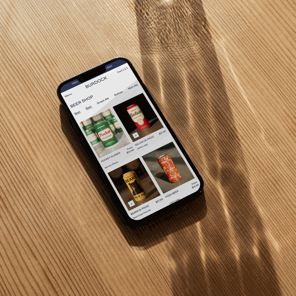
EASY BREEZY DISCOVERY & DECISION MAKING
The strategy: when you’re shopping for beer online, you want to be able to see everything available, scan for the styles & flavours you like, and build your cart quickly. This isn’t a long-term decision; it’s beer. People want to try nice things. Bingo, bango, bongo (Matt would say). So on the site there’s special features like a v fast add to cart experience that was designed in particular for when they were selling singles. You can add 1 & modify quantity easily without leaving the grid. You can see your choices represented on the collection grid and get a feel for what you have or want to buy more of at a glance. Most discovery & decision making is taking place on the collection page instead of toggling between it, product pages & the cart. This is also why top-line descriptors are prominent on the product grid & the sub-nav allows you to bounce between styles. No need for a filter, either.
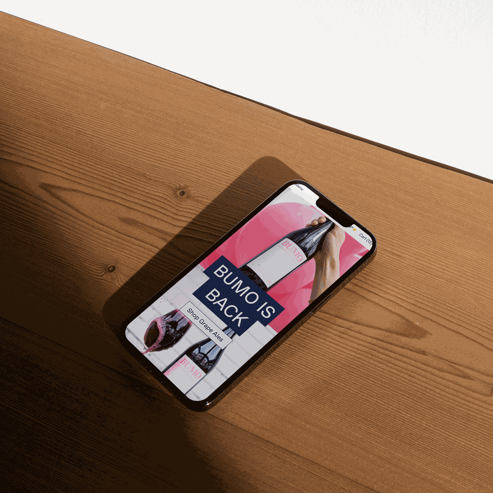
PLAYFUL MINIMALISTS
Burdock are playful minimalists. The site itself is quite simple visually: the colours are stripped back (it’s mostly navy, with a few strategic pops for utility), and Dinamo’s Favorit (a cult classic) is the only font. We even used it for the alternate wordmark online. (Burdock is v playful with its logo elsewhere.) Burdock came in with the original script logo, their blue, and not much else, but we built around the feel of the product and packaging. The web design provides a frame for the labels, merch, physical spaces, photography, and even the copy (you always know when Matt has written something). We’ve played around with features, like displaying Toronto’s weather in the header, mirroring a signature element of newsletters (it was hard to find a reliable app for that though), or trying gifts with purchase (the desired concept had some obscurities …), but generally came back to K.I.S.S.
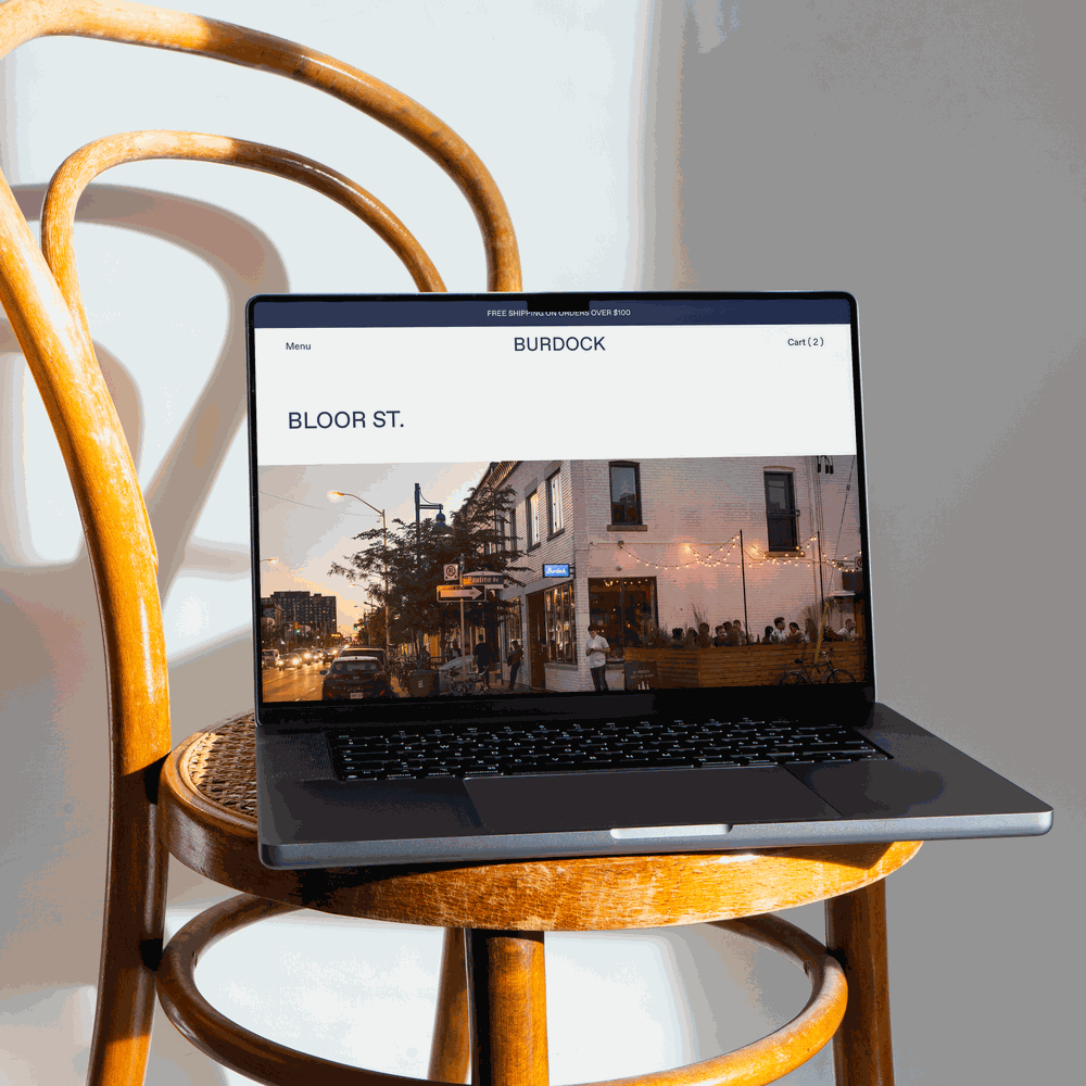
REAL NICE SECONDARY PAGES
While I firmly believe secondary pages should ALWAYS be v v nice, their locations are an important part of Burdock’s business & it’s a core way they continue to grow. They opened up Kensington Tavern last year, for example, near their Denison Square brewery. So we showcase the breweries and restaurants by location, sharing menus, making it easy to make a reservation, and explore options like Brewery Tours and shows at Bloor’s Music Hall.
Amy was instrumental in quickly upgrading & redesigning our website to handle the ecommerce volume that came with the pandemic. She helped us first build our first site in Squarespace (which was awesome), then transition the site to Shopify (which was even more awesome), and now lead an update as we grow even more. Amy was an absolute delight to work with and the speed and quality of her work is very impressive. Would highly recommend working with her if you're interested in setting up an e-commerce platform that is both beautiful and converting.
— MATT PARK, CO-FOUNDER & BREWERY DIRECTOR, BURDOCK