Web Design
Shopify Development
Custom Features
App Integrations
2022
(Now Closed)
PS
Coffee
PS Coffee is a Montreal-based roaster offering alternative ways to learn, think about & connect with your daily cup, recognizing that most people understand little about coffee's journey from origin to cup and its impact along the way. They don't have a physical location, but, developed by the folks behind Elena, Nora Gray & Gia, they're in restaurants, shops & homes not just around Montreal but North America care of wholesale and their site. This was part of my continued work with the restaurant group.

Balancing Selling & Storytelling
The product pages carry dual weight: easy purchasing and depth of storytelling. Below the Add to Cart button, expandable tabs hold the description alongside two secondary tabs — essentially footnotes, referenced inline in the description itself. They cover Processing & Varietal and Region of Origin. A different colour differentiates these from the primary description, signalling that they're optional but there if you want them. Further down: producer and region storytelling, FAQs, other coffees to explore.
The philosophy throughout is the same: more is always available for those who want it, and never in the way of those who don't.
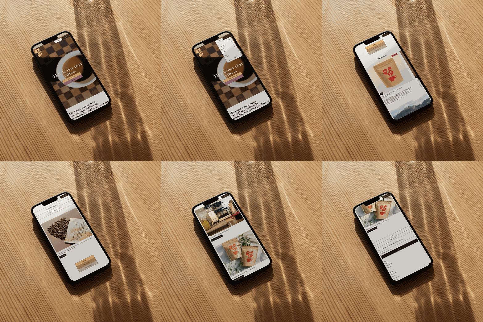
THIS IS NOT THAT COFFEE
PS Coffee's position is that mainstream specialty coffee perpetuates a cycle where producers are kept at a distance from access and agency, while coffee drinkers remain unaware of how they could drive a more equitable consumer culture. PS connects directly with smallholders to support producers' transition toward autonomy and away from exploitative models — and engages their community and wholesale partners to make that mean something at the cup.
The challenge on the site was translating this into something that could function first as a clean shop, and second as an argument for why this coffee is different. Short, layered producer stories appear throughout — including in the product grid itself, where they do double duty: context for the curious, and a quiet nudge toward the right coffee for everyone else.
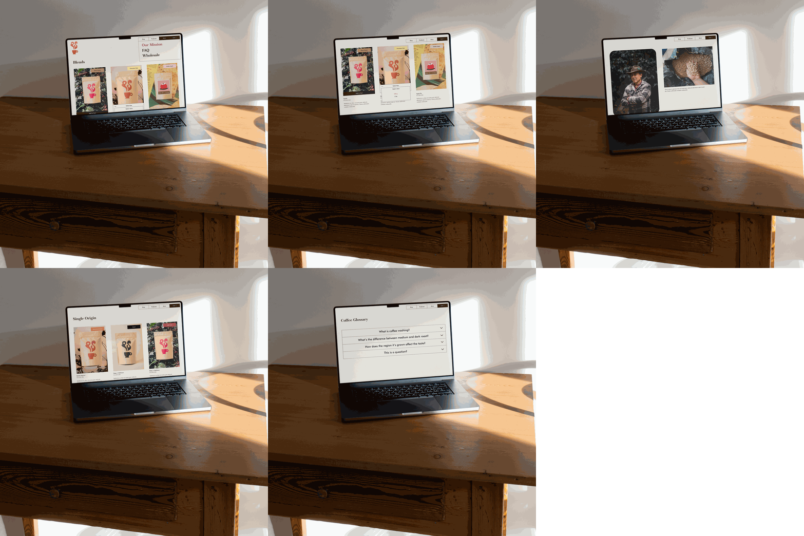
Explore at Your Own Pace
The custom collection page consolidated all coffees in one place, broken up by Blend or Single Origin, which made sense given PS's focused range. Each coffee carries a flavour badge ("Chocolate Cake," "Diner Classic," "Apple Pie") using colour as a quick orientation tool. Add to Cart lives directly in the grid, and bag size & grind can be selected without leaving the page. Producer features carry through here too. A Coffee Glossary closes the page: approachable definitions for terms like "coffee washing" for anyone curious enough to go there.
The sticky nav deserves its own mention: because the PS logo is long and distinctive, it couldn't travel down the page without forcing a v wide header. Separating the logo from the menu allowed for a compact bar that follows you through the site & became a signature design element that recurs on the site.
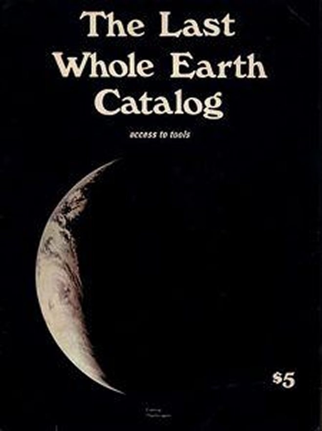
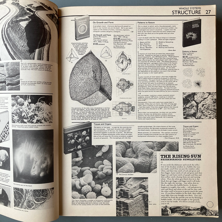
→ Fun fact: PS came to me with little more than a logo, packaging, photography AND a key reference: The Last Whole Earth Catalog.
Ready for the next chapter?