Web Design
Shopify Development
App integrations
Flodesk Email Design
2021-2025
Good
Cheese
Good Cheese is a small neighbourhood cheese, wine and fine foods shop in Toronto’s East Chinatown. Luke doesn’t believe in a high brow/low brow divide. He just wants to share all the best stuff. The shop on Gerrard is the perfect spot to pick a few things up on your way home or pop in for a special occasion. They’re one of the only spots in the city with both cheese & wine expertise, offering regular tastings ++ a Cheese Club (and now Coffee Club). I've worked with Luke since 2021 when we first overhauled the site. He now has a real e-commerce operation while remaining unpretentious, curious and genuinely good.
Offline comes Online
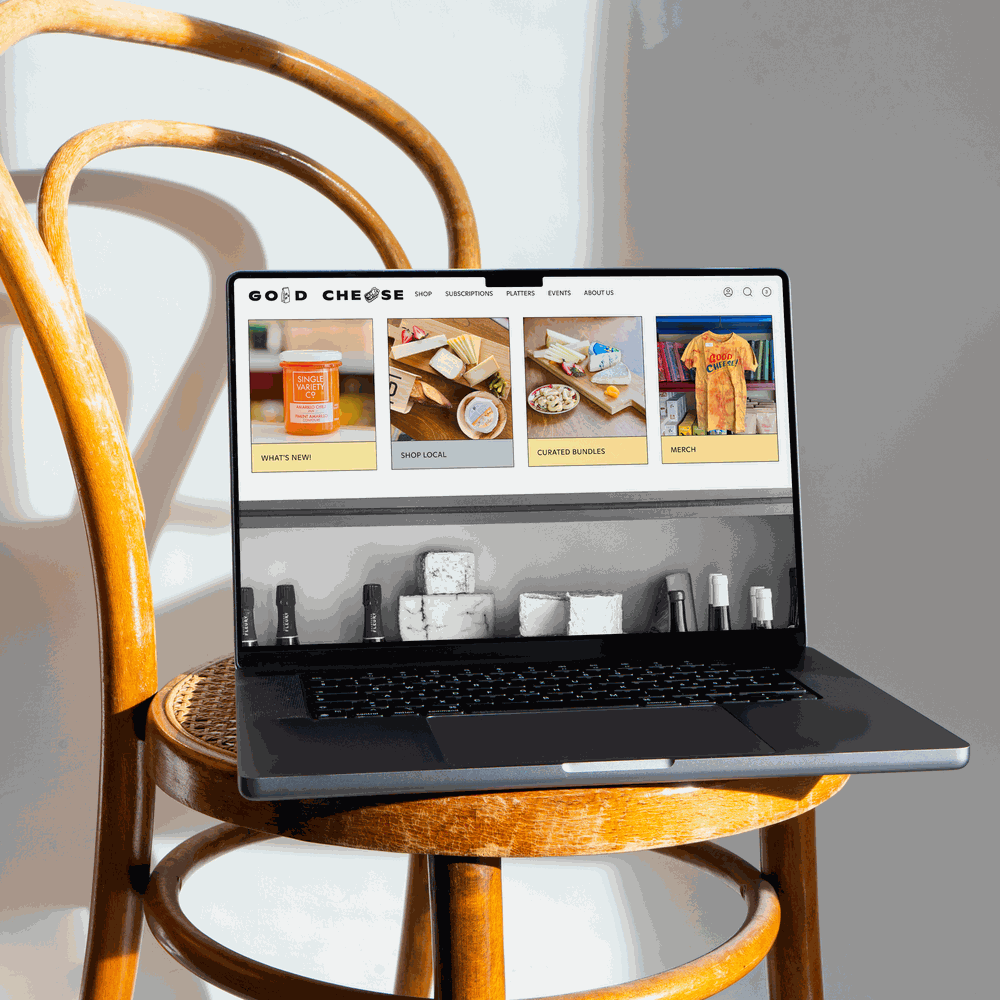
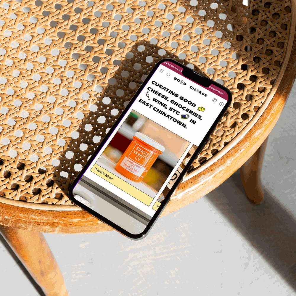
Shopping the site feels like talking to someone behind the counter — all product descriptions are written by the team, so there's a consistent POV running through everything, whether it's a natural wine from a tiny producer or the best chip you've never heard of.
Inspiration for the visual update came from the shop itself. Luke worked with Company Company on a refresh of the interior, and we brought that evolution online, trading the original primary colour suite for the new colours of the shelves: burgundy, muted blue, buttery yellow, faded pink. Photography is shot in-store, and black & white images of the shop and neighbourhood are woven throughout. The original shop logo (also on the signage) lives on in the footer, and the primary colours still appear in select icons, but the overall feel is more mature now.
Making the best stuff approachable
Cheese & wine in particular can be quite snobby, maybe even moreso when paired, but Luke has a way of making both incredibly approchable. We want you to feel like you can find interesting things without any special expertise. So the design is quite unpretentious & playful. When I designed the first version of the site in 2021, we collaborated with an illustrator, Kayla Whitney, on icons and scenes that we continue to utilize all over the site. I selected a warm, idiosyncratic and geometric font in several styles from Dinamo that we use on everything, including the alternate wordmark. And balanced all of this with black & white photography of the shop and neighbourhood.
Findability meets discoverability
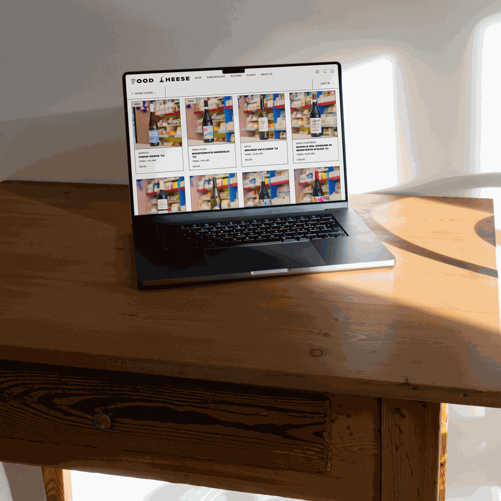
This was another site with a large catalogue (something I work with a lot). So the site balances findabilty with discoverability (easy to get to what you want when you know what you want, easy to discover new things you didn’t know you wanted). We have a large mega-navigation on desktop and a more broken-out nav on mobile (less nesting). Search is front & centre. We talk a lot about what’s latest b/c that tends to be what people want & it brings customers into their everyday world — like we just brought in Baldassarre’s Tiramisu or wine from Anders Steen, so we profile those on the homepage along with other popular collections , whether local brands or curated bundles (cheese plates!). The filter isn’t cluttered with options but nicely directs and guides people, utilizing the same approachable language found everywhere.
Working with Amy was a true pleasure. From the get-go she surprised and delighted us with her ideas on how to make our website not just work better from a consumer perspective, but for us as well. They took a holistic approach to the design that was beyond anything we had imagined going into it and we couldn't be more pleased with the outcome. Her work was always focused & direct, professional, and on time. She was patient and helpful when we had questions. Ultimately she made a big complicated project feel natural & easy while delivering a product that we are absolutely thrilled with.
Luke Champion, Founder of Good Cheese